Gazelle Cayo
- Case Define the colour and graphics strategy to launch the Gazelle Cayo into a new market segment
- Client Royal Dutch Gazelle
- Industry Mobility
The Gazelle Cayo marked a new design direction for the brand, a category Gazelle hadn’t occupied before, for an audience that didn’t yet know them. The brief was focused but expansive: define the colours and graphics that would make this bike resonate with a new kind of rider, and help Gazelle enter the segment with confidence.
The real tension sat underneath the brief. Create something genuinely new, outside Gazelle’s comfort zone, while keeping it unmistakably theirs. Speak to an audience unfamiliar with the brand, without alienating the riders who already love it. And shift a perception: Gazelle is not only about quality and function. They understand trends, and what premium means today.
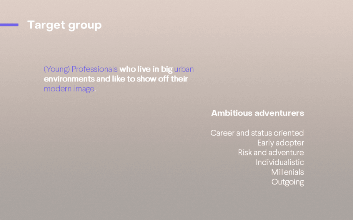
To design for a rider who didn’t know Gazelle, we first had to understand that rider’s world. We profiled the 2026 consumer: a buyer moving toward hyper-personalisation, who values uniqueness, sustainability and the freedom to curate their own possessions and built two personas to keep the work honest: Kai, the trendsetter who reads confidence in restraint, and Nina, the quality seeker who chooses premium over loud. Both respond to considered objects rather than badges.

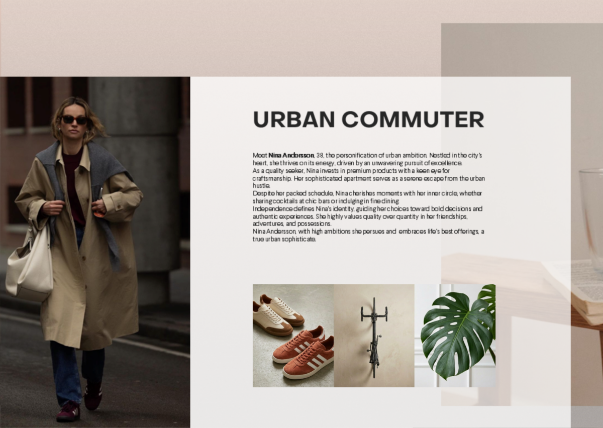
The decisive evidence came straight from the target rider. In user research, young professionals in Amsterdam’s business district, Cowboy and VanMoof owners who felt “a little too young for Gazelle” but respected its quality. They told us plainly what they wanted from the bike:
“Beautiful bike, the colours are good. Just rather not too visibly Gazelle on the bike, branding can be minimal.”
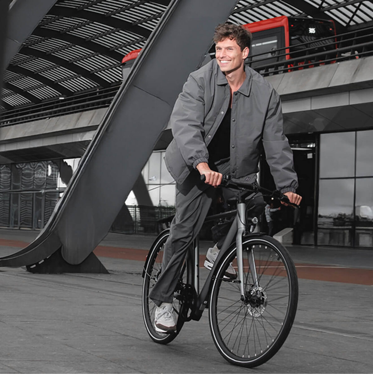
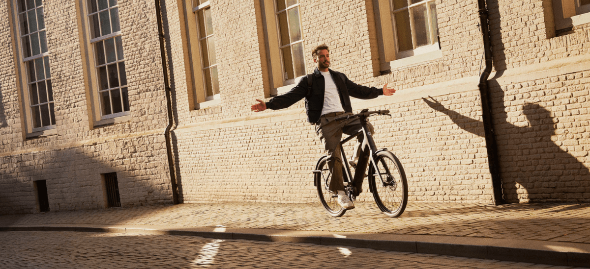
That single review crystallised the whole strategy. This audience wanted a status symbol that fit their image; heavy branding worked against desirability. For Gazelle, long anchored in heritage and recognisability, that pointed to an uncomfortable but powerful move: lead with the design, not the logo.
We started in the rider’s world, not the product. Market and audience research mapped the values and aesthetics of the 2026 urban commuter; persona development turned that into profiles built on real motivations rather than assumptions; and a user review with actual VanMoof and Cowboy riders tested the bike against the people it had to win. In parallel, we positioned the bike in Gazelle’s portfolio (emotion over ratio, leaning ‘me’ and innovative) and mapped cross-category brands this audience gravitates to, read for cues without imitation.
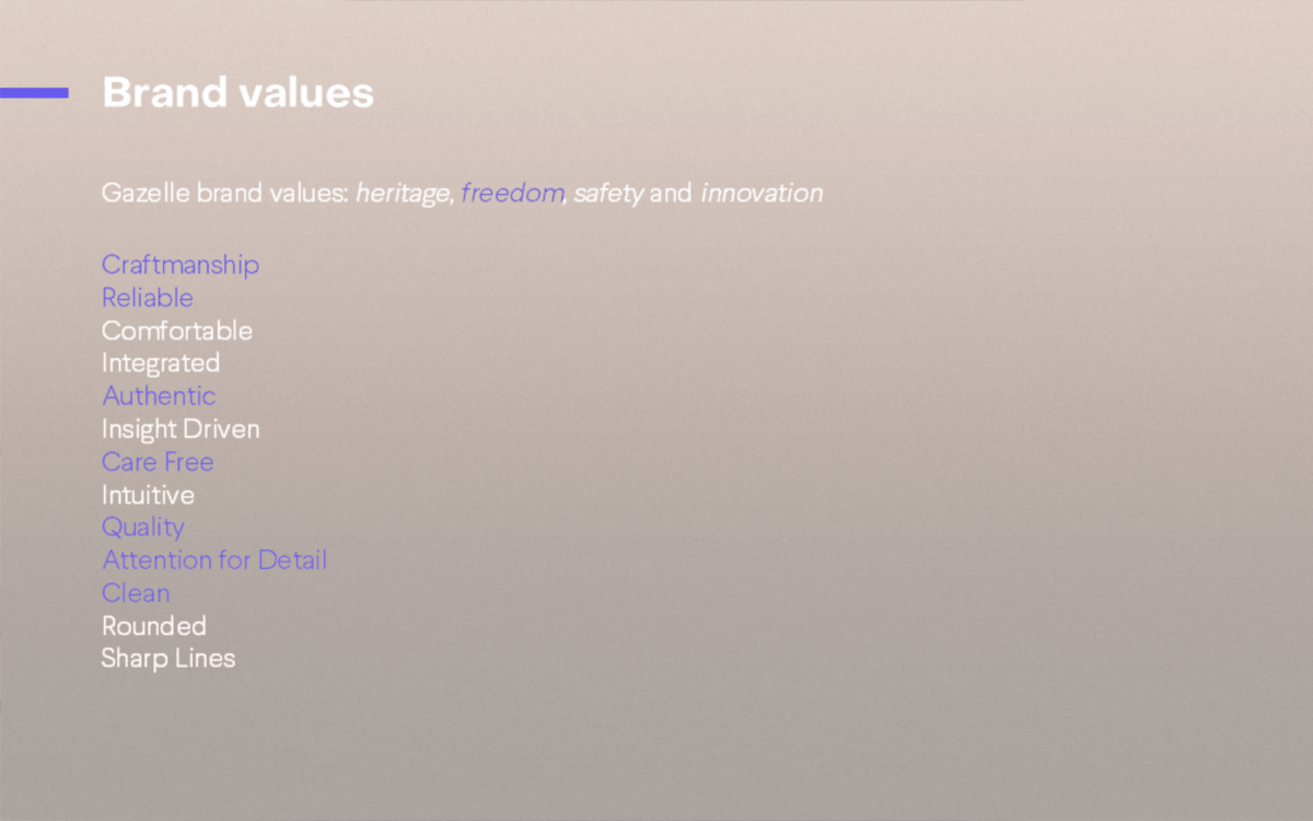
The findings set the design mission: a bike that feels desirable before it feels familiar. We weighed brand alignment against differentiation, holding on to Gazelle’s core values of craftsmanship, quality and attention to detail while extending them toward personal, premium and sustainable. New enough to claim a different segment, unmistakably Gazelle underneath, and premium in the way this audience actually recognizes premium: through restraint and intent, not volume.
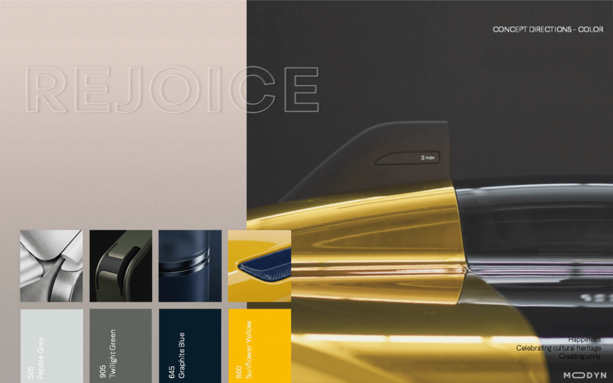
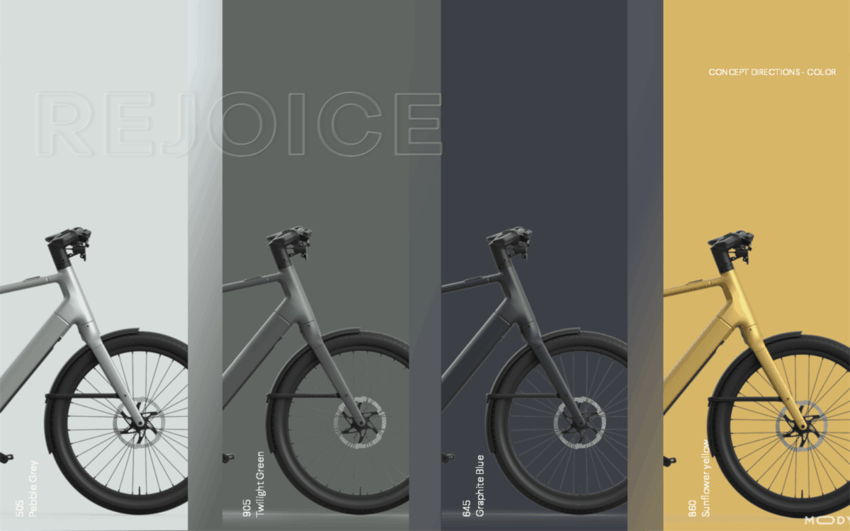
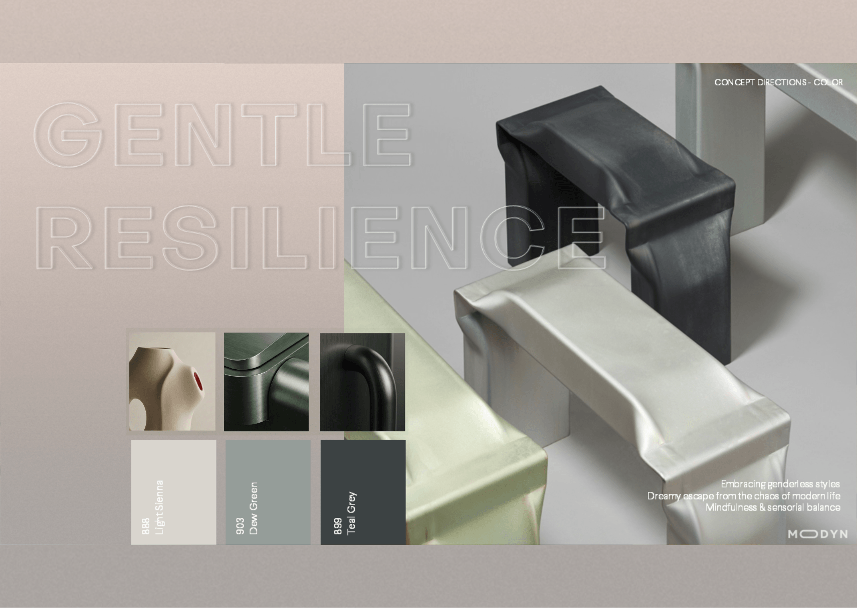
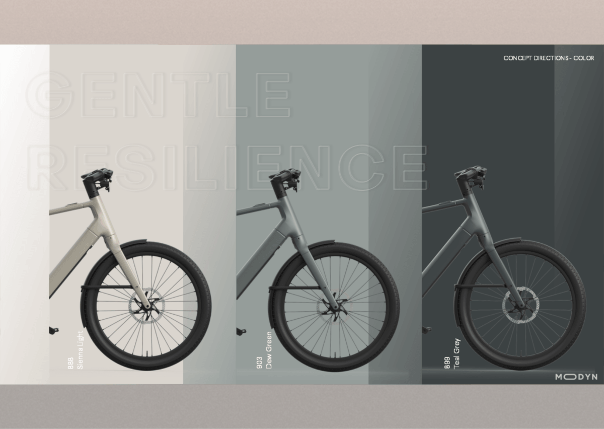
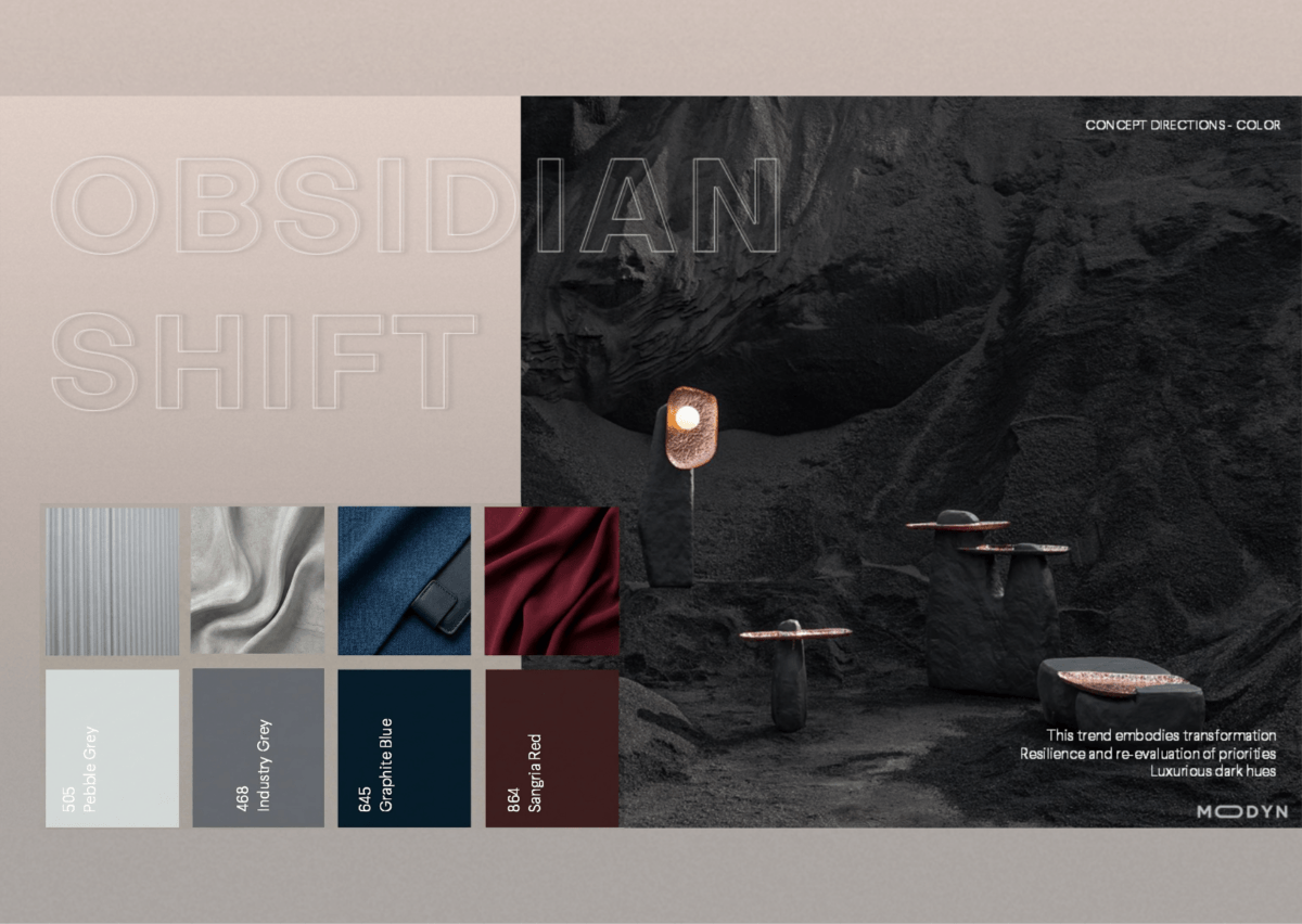
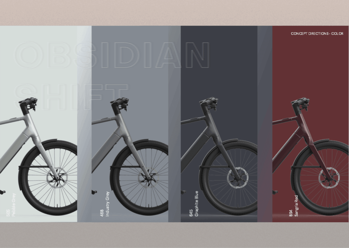
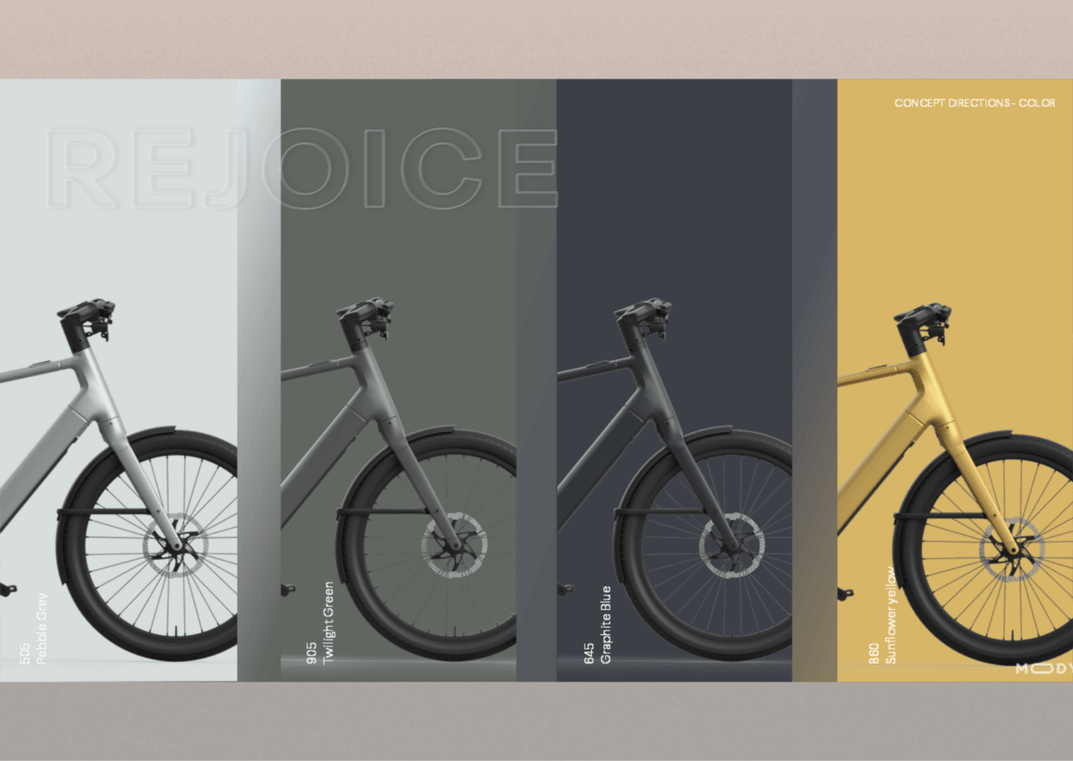
Colour and graphics carried that intent. Working from MODYN’s 2026 trend vision, our CMF team selected Rejoice, a direction rooted in craftsmanship and heritage, as the best fit for this rider. Then developed a matt colour range to match: Pebble Grey, Twilight Green, Graphite Blue, Sunflower Yellow and a Metallic Orange alternative. Each was rendered on the full bike to test character across the line.
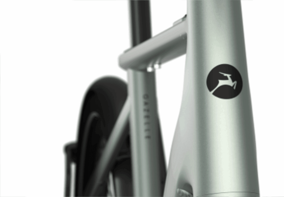
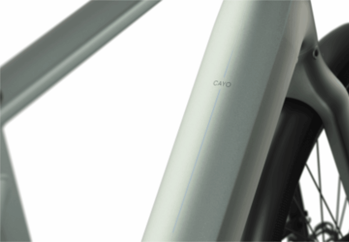
But the pivotal call was logo placement. We challenged the brand to think further outside the box and moved the Gazelle wordmark from its prominent side panel to the top tube; Minimalistic, subtle, barely-there branding that blends with the bike and reads as sophisticated and premium. It shifts the entire character of the object, from heritage utility to considered design. Desirability over recognition.
The strategy was resolved into a coherent colour and graphics package: colourways, finishes and a branding strategy. Ready to take the bike to market as the Gazelle Cayo, giving the brand a confident entry point into the new segment.
Gazelle entered a new market segment without diluting its identity. The colour and graphics strategy gave the Cayo genuine audience fit: A design that resonated with a rider who didn’t yet know the brand, while shifting perception from purely functional to trend-aware and premium. The logo strategy crystallised it: top-tube placement, subtle and confident, signalling a brand secure enough to let the design speak first.
- A new market entered: without diluting Gazelle’s identity
- Audience fit: A design that resonated with a rider who didn’t know the brand yet
- Perception shift: Trend-aware and premium — not only functional
- Logo strategy: Top-tube placement. Subtle, confident, desirable
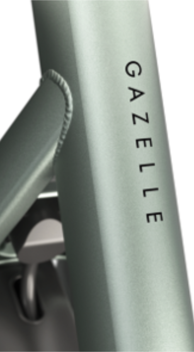
The highest honor in this prestigious international design competition. The jury awarded the Gazelle Cayo 95 out of 100 points for its outstanding minimalist design, geometric aesthetics, smooth transitions, integrated details (like the seat clamp and logo placement), and overall urban mobility innovation.
Nominated for Fiets Awards 2026 (Dutch Bike Awards): Selected by an independent jury as a contender for E-bike of the Year 2026. Gazelle also received a nomination for another product (Cabby Cargo bag) in the innovation category.